Vodafone Help & Support Area
Vodafone website: empowering customers to find solutions to their problems and issues
- User research
- Data analysis
- Prototyping
- User testing
- Definition, layouts and experience design
CLIENT
Vodafone
INNOVAGENCY ROLES
Strategy, UX/UI Design, Search configuration
CHANNELS
Website
TECHNOLOGIES & TOOLS
- Empower a self-service approach that allows Vodafone’s customers to be autonomous in solving problems and doubts without having to go to the call center
- Optimize the search experience across the whole website by identifying user needs, designing the best experience, and configuring the Cludo search tool, leveraging its potential
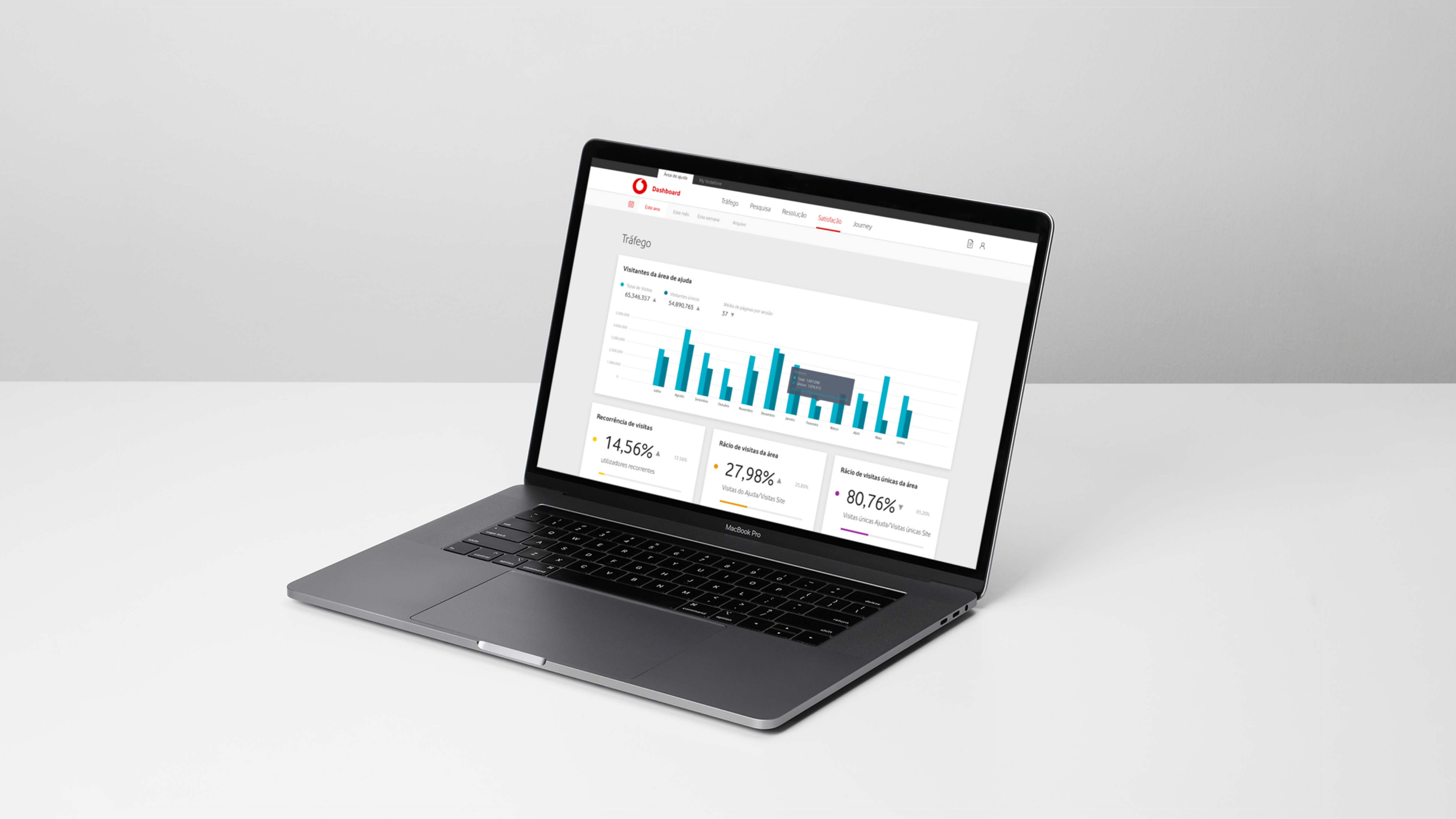
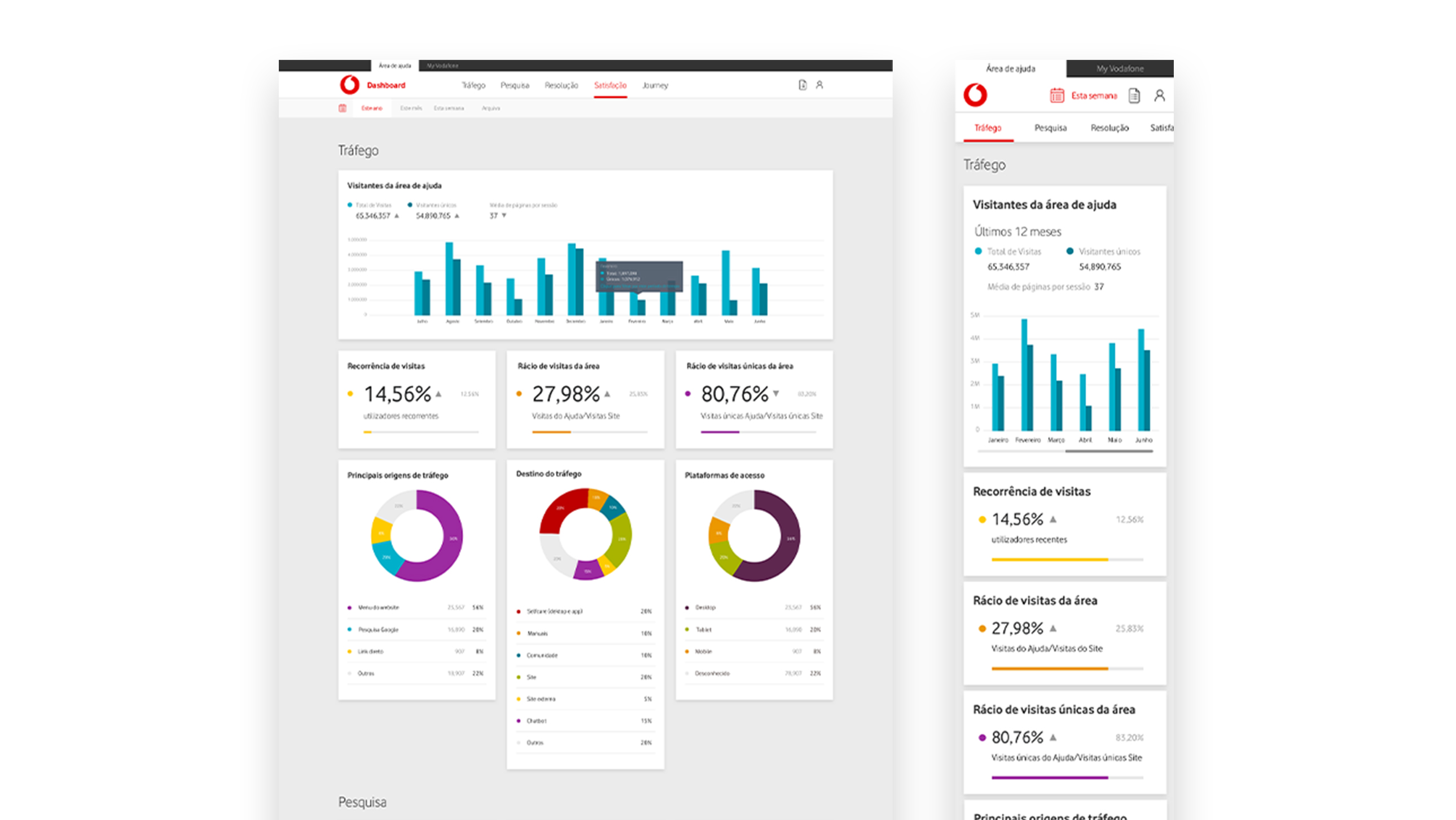
- Design a dashboard to track and monitor the usage data of the website’s self-service tools by Vodafone’s teams
A disruptive solution, driven through a process of design thinking
Before our project, every time Vodafone customers had a question, they called the contact center. They also tried to search online but couldn’t find the answers to their questions.
Vodafone had an added cost because its customers were using a more expensive support channel to ask very common questions, multiplying the customer support costs without necessarily offering an advantage in customer satisfaction.
This was the situation when Innovagency and Vodafone started working together on a solution that would allow customers to have a good self-service experience in the support area of the Vodafone website.
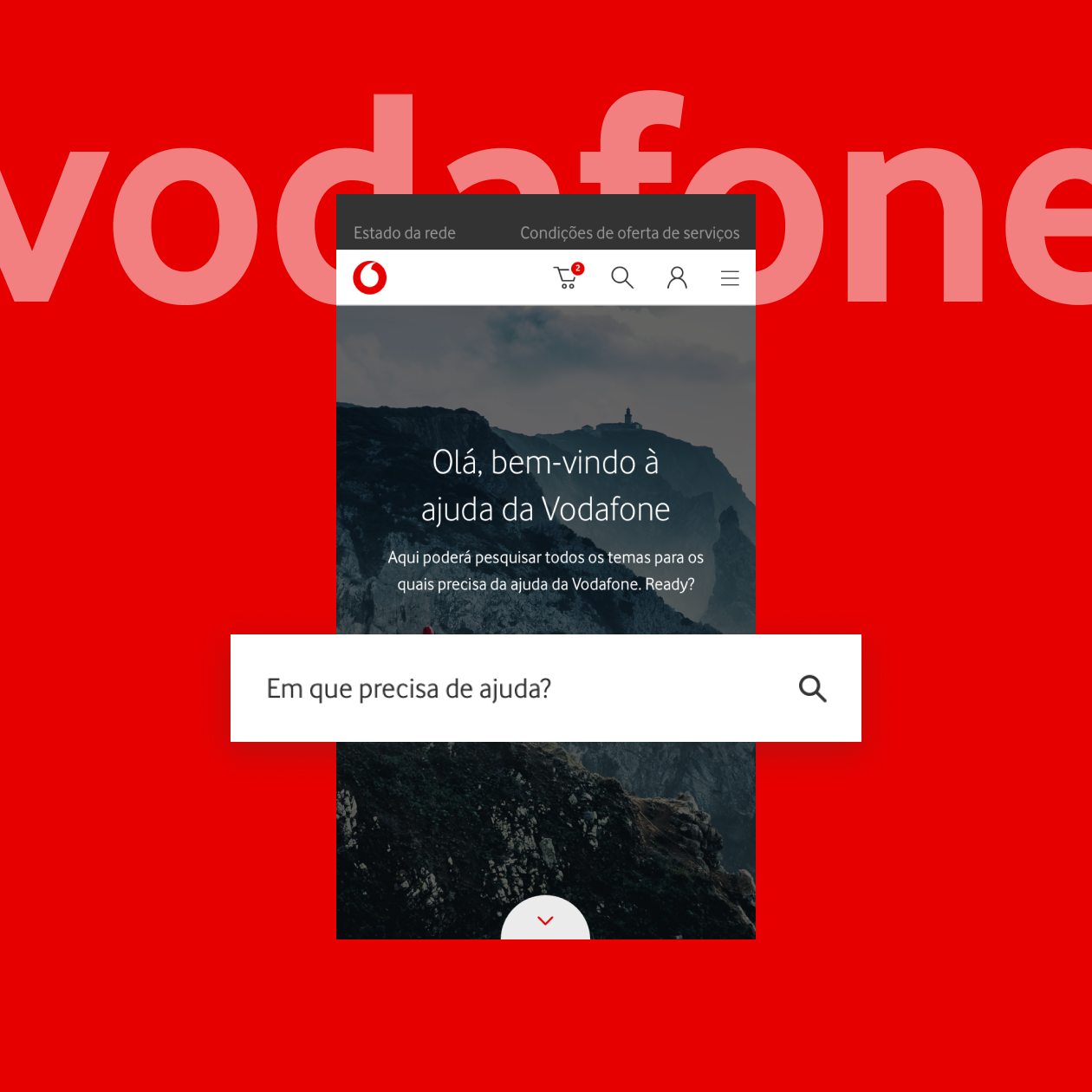
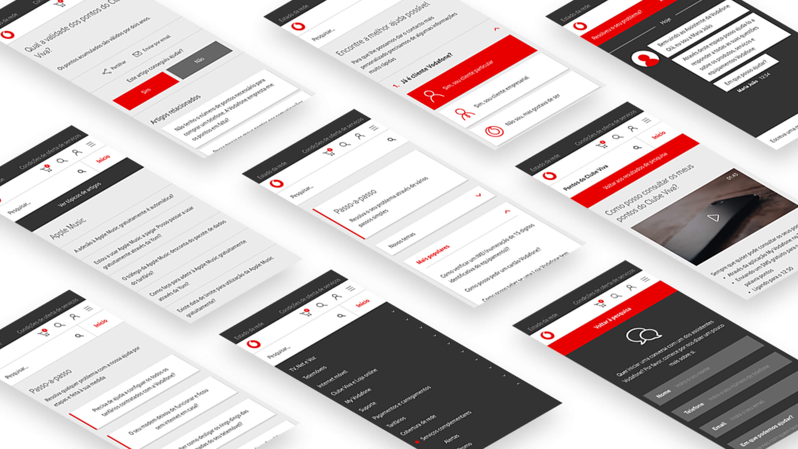
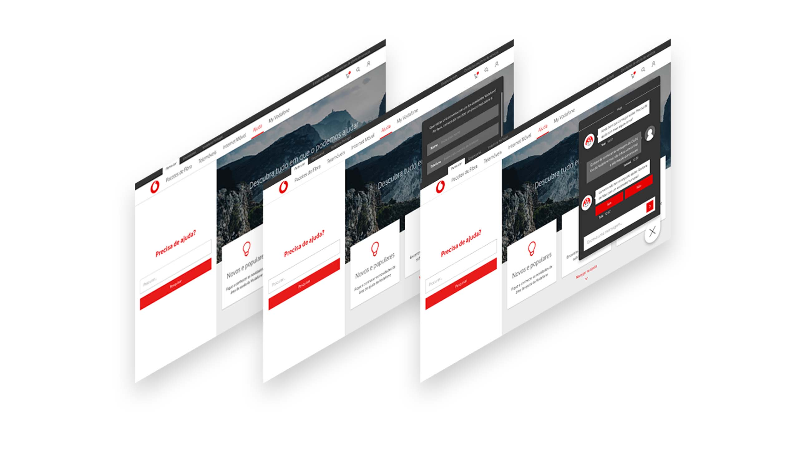
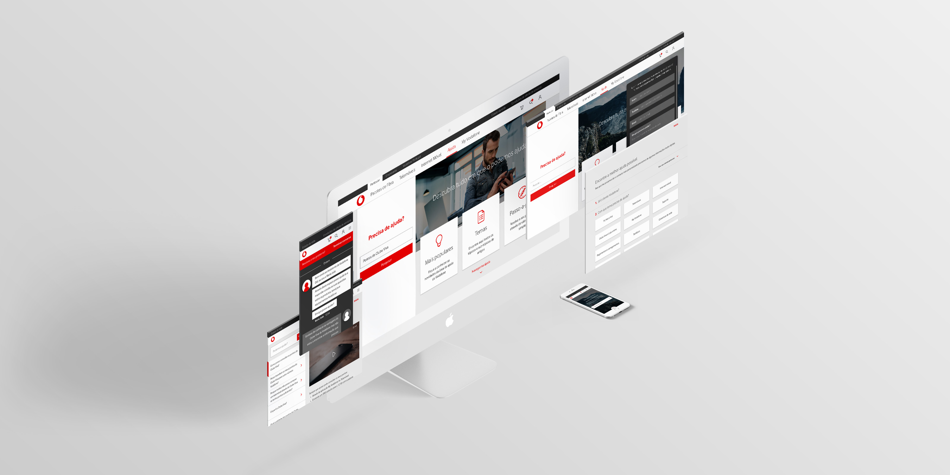
To meet this objective, a new search experience was designed with an elastic search solution, and the customer experience for accessing help content was redefined. This area included contents such as FAQs, manuals, and a routing solution to the ideal contact channel in case of less standard questions. The project also included the redesign of the chat layouts in one-to-one support to customers, both in real-time and on a digital channel.
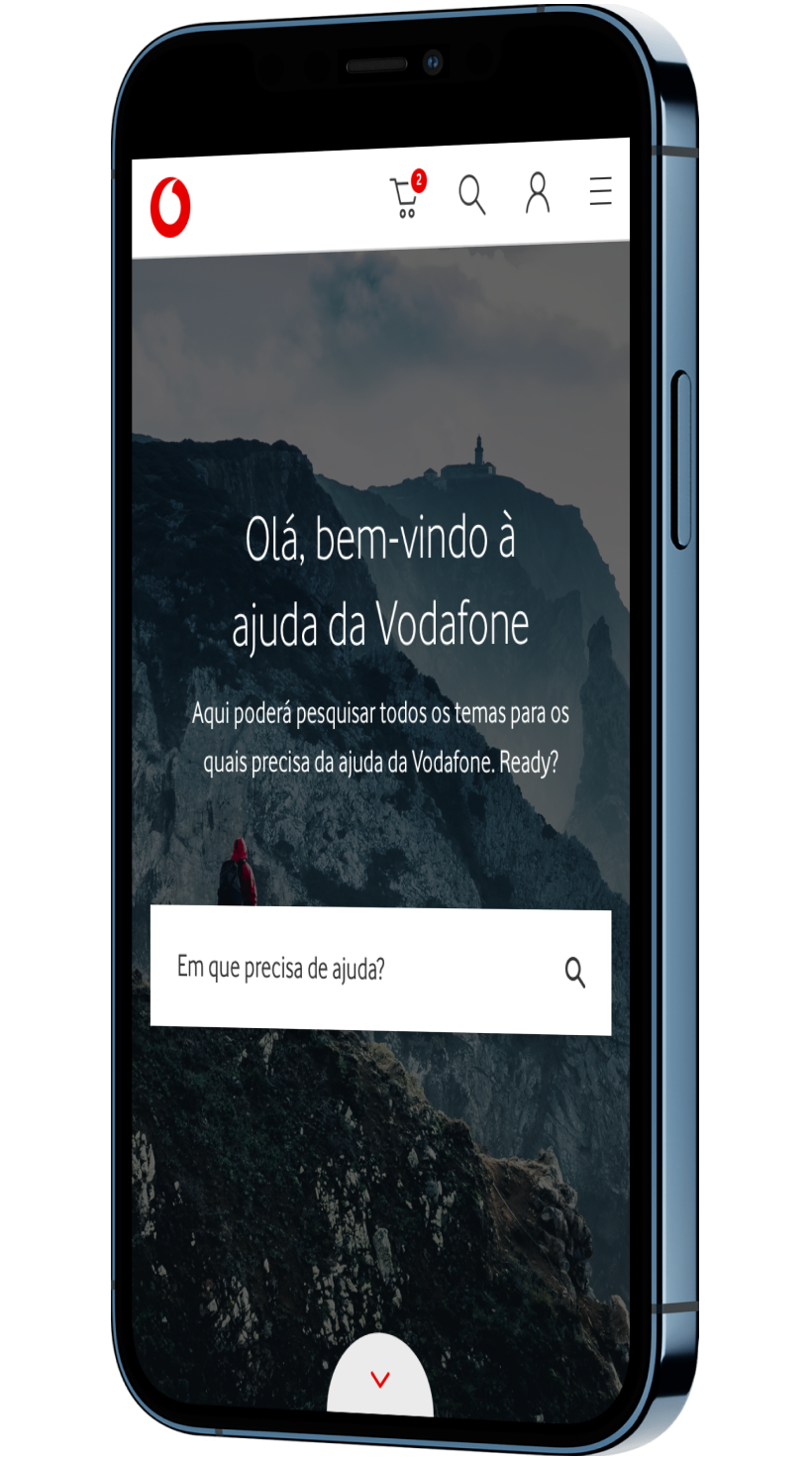
Today, Vodafone customers no longer need to call Vodafone. When they need to find a bill, clarify a question, or understand how a particular piece of equipment works, customers can easily use the site search, find the right content, and even link to the My Vodafone customer area. This work has helped improve the user experience and speed up the resolution of doubts and problems.
A process highly leveraged on user research tools
During the project, several user research tools were used, such as: the construction of personas, based on information from Vodafone's customer info; a survey, available in the help area of the website and answered by users of the Vodafone website; and a card sorting exercise, very relevant for the arrangement of content in this area.
This preliminary work did not exempt the need to test the solution designed for Vodafone
After designing the solution based on all the information collected and analyzed in the initial phase of the project, we reached a very important stage in UX/UI projects: the usability tests with customers. The goal is not so much to validate what was defined and designed, but essentially to optimize and fine tune the solution based on input from real users exposed to the new solution.
Personas built and used during the project
5
Survey responses
766
Card sorting participants
41
Usability tests participants
16
What we've been up to
